MOLECULAR THEORY, acrylic on acrylic, 3 x (17 x 17) inches, 2020
by Chris Keatly
Director Curator Pendulum Gallery
From his early paintings of landscapes, nature, and interiors; to his catalogue of buildings in the changing Vancouver cityscape, through his collage works and related paintings and on to the most recent body of abstractions on Plexiglass, Tiko Kerr’s work has been fundamentally about ‘seeing’; both how he personally sees the world and the ways the human visual system functions to interpret the world.
His Vancouver buildings series, perhaps his best-known works, are identifiable in the way he interprets his subjects in wavy and wobbly lines, as if seen in a body of rippling water or a distorted mirror. This is not just a conceptual strategy to suggest something unstable or surreal in our built environment, but rather is derived from Kerr’s astigmatism that causes him to see things this way. In talking about these works he has said:
When I’d look at a building, my astigmatism would cause me to see it slump somehow, to lean or to soar. I told myself that I was merely depicting the spirits that inhabit all things.1.
His collage works on paper and related paintings suggest a fragmentation of experience and the perfunctory way we now engage with a world that gives us an excess of both images and information:
The collages are based on the idea that in our contemporary moment, we are constantly bombarded by onslaughts of images and data, our attention is fragmented and seeing is cursory. Collage provides the best description of how we engage with the velocity of the world.1.
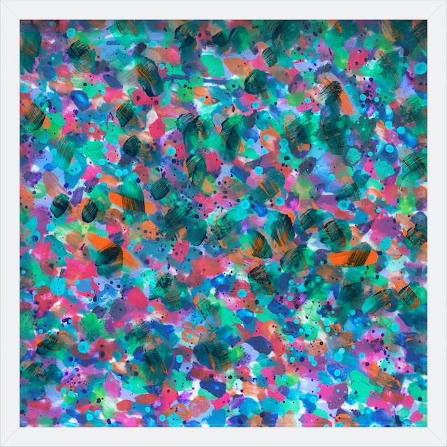
His astigmatism also leads to a haloing of complementary colours … around violet I see yellow; around blue, orange, and around green, I see red… These same conditions occur in Van Gogh's paintings. This effect of his astigmatism can be seem manifesting itself in the Plexiglass paintings, where it is combined with Kerr’s exploration of colour theory and the physical and psychological impact of individual colours and colours in combination.
These works might be considered merely successful abstract works if produced on canvas, but with the expressionist marks set out over multiple layers, the paintings become a hybrid of painting, relief and sculpture, providing complexity and contradiction to works that use clear sheets of Plexiglass as both material and metaphor.
Plexiglass
A man-made and intrinsically modern material, Plexiglass has a long history. Invented in Germany during the last century. Chemist Otto Röhm came up with the idea in 1901 but it took him another 30 years to figure out what to do with it.
Low-cost and versatile, plastics immediately drew the attention of artists with a penchant for exploring new materials and techniques to develop revolutionary means of expression. 2.
Beyond the precedents for the use of Plexiglass in art, Kerr is interested in the contemporary uses and meanings of Plexiglass in our current Covid age. In an insightful article in Places Journal, writer Shannon Mattern outlines a cultural history of Plexiglass in which she says of our current use of the material :
The new architectures of protection hastily installed across our built environments aim to keep us safe — pure, secure. They do this not by addressing the virus’s mode of transmission via vaccine or socially distanced quarantine (much less by reassessing relations between humans, animals, habitat loss, and environmental health), but rather by making the COVID-19 world inhabitable through minimally invasive, barely visible intrusions into our familiar terrains. Pandemic plexiglass is deployed as part of a preventative, conservative practice, a means of maintaining social and biological order that, in turn, promises epidemiological and economic resilience. 3.
Plexiglass is a perfect expression of our contemporary moment – a modernist material repurposed for the age of the pandemic, a protective barrier that allows us to see but not physically connect. Cultural theorists note it foregrounds the visual senses at the expense of other senses such as touch, smell and sound.
A New Abstraction
The potential reading of the Plexus works as ‘simply’ abstract painting is an interpretation that Kerr has overcome by focusing on the historical and contemporary cultural references of Plexiglass, informed by the properties of the material itself; particularly, its use as a transparent, yet solid surface on which to paint. He repurposes the Plexi sheet from a barrier to a window, one which connects us to the action beyond, using a visually permeable surface to stack his imagery and radically activate colours, shapes and painterly actions.
These paintings are made up of a series of differentiated marks on the 3 plexiglass layers, arranged so they read as one image. There are in fact 5 surfaces: the top sheet of Plexi is painted on the top only, with layers two and three painted on both front and back. Kerr has had to develop methods to paint on Plexi to achieve the effect he his after. In places he has used Interference paint to get a brushy looking stroke with open segments in the application; these strokes open the view to the action that is happening underneath this layer.
These works all share the visual experience of looking through and into and in this way, they remind us of windows, aquariums, laboratory slides. They challenge us to locate the brush marks in space and to follow along with the rhythms and patterns of paint as they blend in and out, push forward and fall back. They contain literal depth rather than illusional depth and this pushes them into the realm of reliefs. Yet they are, pardon the pun, clearly paintings and it is the brush marks and colours that hold our attention.
Your eye continually pulls focus between the full image with all the layers combined and the individual strokes on each of the layers. It’s a bit like three-dimensional chess in the way your brain needs to fit things together into an image of two-dimensional space in order to understand how they operate. While your brain is manipulating the conceptualization of the space, your eye is moving in and out of various depths of field, locating the brushstrokes in the space.
These layered paintings excite our visual sense through a reading of the individual marks in combination with the relationship of various colours in both two-dimensional and three-dimensional proximity. Blue, green, magenta, and orange dominate, and the overall impact is one of harmony and balance. On a studio visit to see the Plexus works in production, I note the frequency of magenta in the pieces and Kerr agrees that he has used it extensively. Colour symbolism is widespread across many cultures. Magenta is commonly used during Holi, the Hindu Festival of Colours. In colour psychology, magenta suggests happiness, contentment and appreciation. It also indicates a non-conformist, a free spirit. A magenta personality is said to have strong connections to spirituality and intuitive thinking. 4.
It's (not) Easy
Everything is completely spontaneous. I work on several sheets at once and after they dry I arrange them and reorient them until they somehow fit. 1.
I would suggest these works are not completely spontaneous, nor are they easy to realize. They appear spontaneous, as Kerr has created them in the moment, guided by what may be termed the Deeper Self, the Unconscious, or the Muse, but this spontaneity is only possible because of the decades Kerr has spent developing and mastering his craft and technique.
Once he lays the first few marks down, what follows is a reaction to those first marks, with a general, if not specific, idea of where the work is going. In an echo of the collage works, Kerr has another aesthetic step in the production of the Plexi pieces: rotating and restacking the three painted Plexi sheets until colours and shapes align in the best way. All this is in the hope that he can produce a visceral reaction in the viewer, an expanding of their visual field, a strategy also utilized in his approach to the collages.
Black & White
The Black and White Plexus works function in a slightly different way than the colour ones. Kerr has said they are inspired by the feeling of reading newspapers; Kerr gets the analog version of The New York Times daily and the material graphic design of the paper underlays these paintings. It’s all there in Black and White, and we try to make sense of the information that is in front of us.
The B&W Plexi pieces conflate this idea of seeking out truth in the (news)paper with seeking out truth in a work of art – they are both blurred by layers of obfuscation and interference. In the B&W works we are keenly aware of what is front and what is behind; swashes of paint mixing and layered over each other or with detailed background layers. These are abstract works that have supercharged the expressionist gesture.
The horizontal collage pieces on Plexiglass are essentially monochromatic, transitional pieces between the collages that Kerr has developed over the past few years and the painted works of Plexus. Utilizing paper segments cut from copies of Jack Shadbolt drawings attached to stacked Plexiglass sheets along with hand drawn and painted segments, they give depth to the works, being conceptually connected to wall reliefs. They function as parallel investigations of space within the Plexus series, directly derived from his work in stage design, with solid elements set out in a way that allows the viewer to engage in the entire visual field contained in the work, relating to each other through pattern, texture and shape rather than colour and transparency.
All of the works in Plexus are rooted in his collaboration with Ballet BC in 2006 (The Four Seasons / Vivaldi). For this dance and music performance, Kerr created live-action paintings related to the performers on stage. A sheet of 5’x10’ Plexiglass was suspended in the middle of the stage with Kerr tracking the movement of particular dancers, applying colour and strokes of oil stick to the back and the front of the Plexi, a central figure in the dance work itself; an echo of the artist performances pioneered by the artistic avant-garde in the 1960’s. Seven performances, seven works created. 5.
His involvement in theatre, and his experiences of designing for the stage, have allowed Kerr to apply ideas developed in his studio practice to real world, three-dimensional spaces, albeit ones in which the point of view and position of the audience is physically controlled. These gigs started with Boy Wonder at the Queen Elizabeth Theatre (1997; with Ballet BC and Vancouver New Music / Touchstone Theatre), and most recently as set-designer for Marion Bridge at Kay Meek Theatre (2019; in what was to be the last theatrical performance for revered Canadian actor Nicola Cavendish)
Fearless
Today, after nearly three decades of being an artist, Kerr is driven and confident, each new body of work surprisingly, but logically, developing out of the works before. He has become fearless. It’s fair to say that he has reached a rich late-middle period in his career, marked by the assimilation of a lifetime of experiences both inside and outside the art world, laying the groundwork for the last decades’ extensive experimentation of visual ideas and subject matter.
There’s a reason they call an artist’s production work; because it takes a great deal of work to master art. A visual artist can be also be said to have a ‘practice’ which broadly describes their working methods and the overall arc of their artistic investigation. It is within Kerr’s practice that we can find the reasons why these paintings are successful, how they are able to both delight us with their beauty and make us think about the world outside the painting.
Kerr’s mastery of fitting things together, understanding intuitively what works and what doesn’t, has come through focused development of his artistic sensibility, long hours in the studio, and honing the skills and techniques needed to bring these works into being. He has, in many ways, become the artist as defined by Carl Jung:
Art is a kind of innate drive that seizes a human being and makes him its instrument. The artist is not a person endowed with free will, but one who allows art to realize its purposes through him. As a human being he may have moods and a will and personal aims, but as “man” in a higher sense - he is collective man – one who carries and shapes the unconscious, psychic life of mankind. 6.
Chris Keatley, January 2021
Notes
1.Personal correspondence from T. Kerr
2.Ricci, Benedetta; “Agents of Change : How Plastic Became an Era Defining Material,” Artland Magazine (May, 2019). https://magazine.artland.com/agents-of-change-plastic-or-how-plastic-became-an-era-defining-material/
In the 1930’s, when Plexiglass was introduced to the market, Russian artist Nuam Gabo seized on this stable and transparent material as a perfect expression of this art. His Constructions in Space sculptures of the early 1920’s pioneered the use of Plastics in Art.
Hungarian Laszlo Moholy-Nagy was particularly interested in demonstrating the relationship between art, science and industry. A pioneering Dadaist and a founding member of the Bauhaus, he fled Europe for the United States in 1937. Here he developed his series Light Space Modulators, in which he painted and scratched on Plexiglass eventually warping the finished work in an oven – all in a way to explore the properties of the new material.
Around the same time, American artist Charles Biederman began to develop his paintings into shallow, painted reliefs. His New York, Number 18, 1938 inserted translucent Plexiglass sheets into white, relief forms, adding a shock of yellow into the otherwise monochromatic scheme.
Donald Judd’s initial floor box structure was made in 1964, and his first floor-box using Plexiglas followed one year later. He returned to the material frequently siting its use as a utilitarian material not overweighted with traditional art overtones. Judd continued to use both clear and coloured plexiglass in both his floor and wall sculptures throughout his career, right up to the late works of the late 1980’s.
3.Mattern, Shannon; “Purity and Security : Towards a Cultural History of Plexiglass,” Places – Public Scholarship on Architecture, landscape and Urbanism (December, 2020).
4. van Braam, Hailey; “Magenta Color” https://www.colorpsychology.org/magenta/ (September, 2020)
5.All this took place as Vancouver artist Alan Storey, who had placed a cap of sensors on the prima dancer, had her movements traced via computer to a drawing machine . Beautiful, lyrical abstract drawings resulted. (Personal correspondence from T. Kerr)
6. Jung, C.G, “Modern Man in Search of a Soul,” Houghton Mifflin Harcourt, Publishing, New York (Original Publication 1933).
